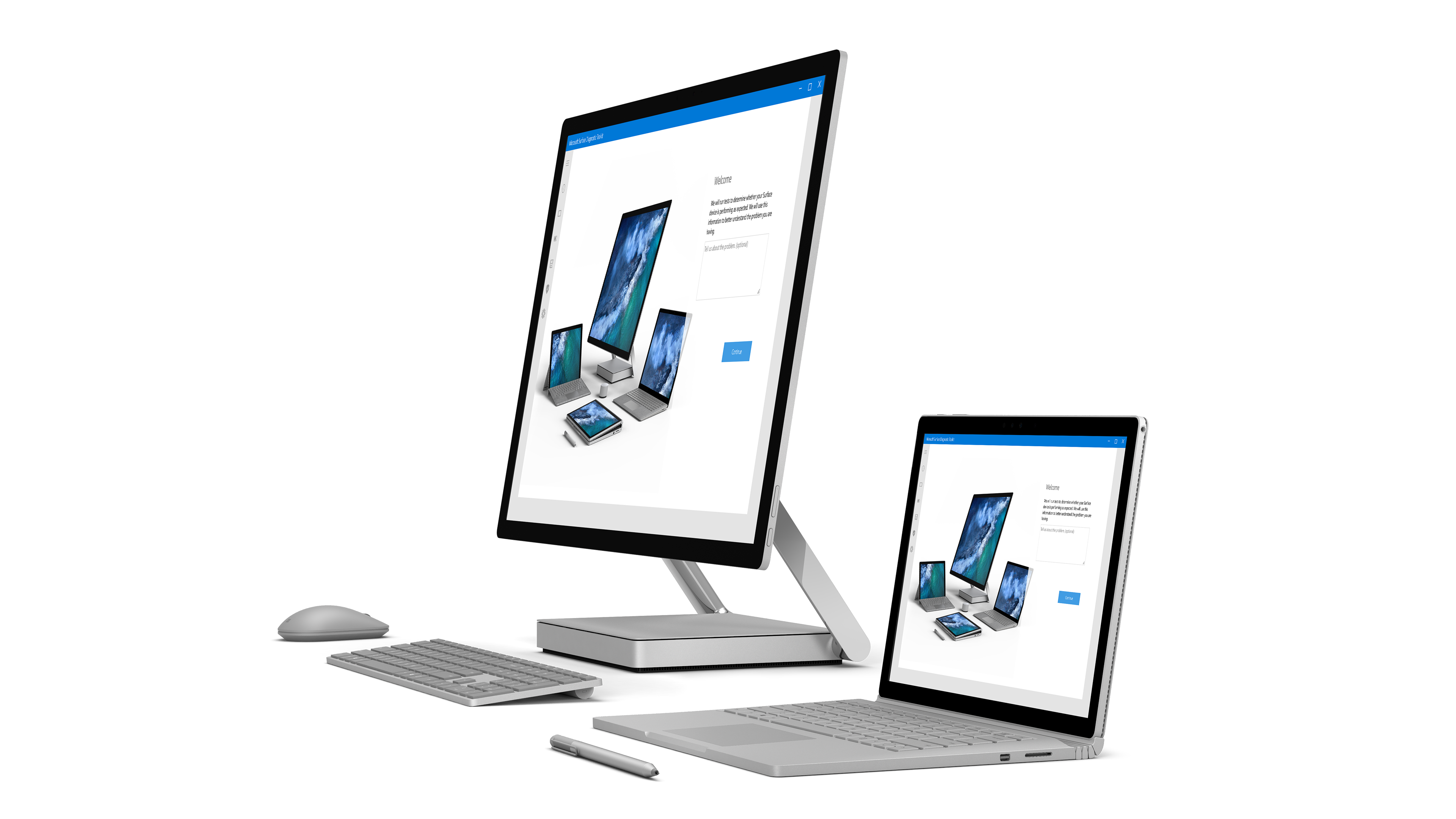
Overview
The application can run a hardware diagnostic to make sure the hardware is the issue and not something that can be fixed through a software patch or user instruction via telephone or online self-help resources. The challenge was to make each test, which require the user to participate and give feedback, as easy to perform as possible.
The potential users for this application included non-technical users, IT Administrators, Help Desk professionals, installers, and factory technicians who wanted to perform audits before shipping.
Working at a new scale
The scale of the Surface Hub should not be overlooked. Because the Hub device is so large, both comfortable usage (arm-span) and brightness of the application were tested.
User testing
User-testing participants all indicated they liked the dark theme opposed to light. White made them squint and they thought it would hurt their eyes if they stared too long.
Card sorting
Before the participants were shown the prototype and asked to complete any tasks, they were asked to put the component cards under the category they believed it belonged to. This lead to category and name changes.
Early design draft
Below is an early prototype with expanding and collapsing result display.
Final design
The final results dashboard allows users to visually access what has and has not been run and what tests have failed. Users can rerun a test or get details and troubleshooting help with errors.
Going beyond diagnosing the problem
Microsoft device users expect the option to troubleshoot independently. The Hub application not only identifies problems, but is designed to help a user take next steps to understand and fix.
Integration with customer service channel
The menus on the left and right of the screen can be accessed throughout testing. Results can be emailed within the application and support tickets can be originated allowing support staff to see a log file from previously run tests.
Visual design specs
Visual specifications could be accessed directly in the prototype.

